The brand had built a strong reputation for quality homes, but its digital experience wasn't keeping pace. I joined the engagement to answer a core question: how do we elevate the digital and physical homebuying experience to match the promise of a Tradition of Excellence? The answer required understanding the entire customer journey.
Project Details
Phase 01
Discovery
Channels & Touchpoints Inventory
We conducted a comprehensive analysis of the brand's channels and touchpoints across four categories: Customer Relations, Physical Environment, Digital, and Marketing. The exercise gave us a holistic view of how customers interact with the brand at every stage, and surfaced the specific touchpoints where improvements would have the greatest impact.
Stakeholder & Customer Interviews
I conducted one-on-one interviews with Sales, Marketing, Construction, and Multiple Listing Service (MLS) teams alongside external Realtors. On the customer side, I spoke with homebuyers across four key groups: Realtors, Home Shoppers, Home Buyers, and Homeowners.
Across 33 interviewees, consistent themes emerged around data fragmentation, pricing transparency, and a post-contract experience that relied too heavily on phone calls and email. From the customer conversations, we built personas and empathy maps that kept real buyers at the center of every decision that followed.
33
Interviewees (25 employees and 8 customers)
10
Divisions & partners
21
1-hour interviews
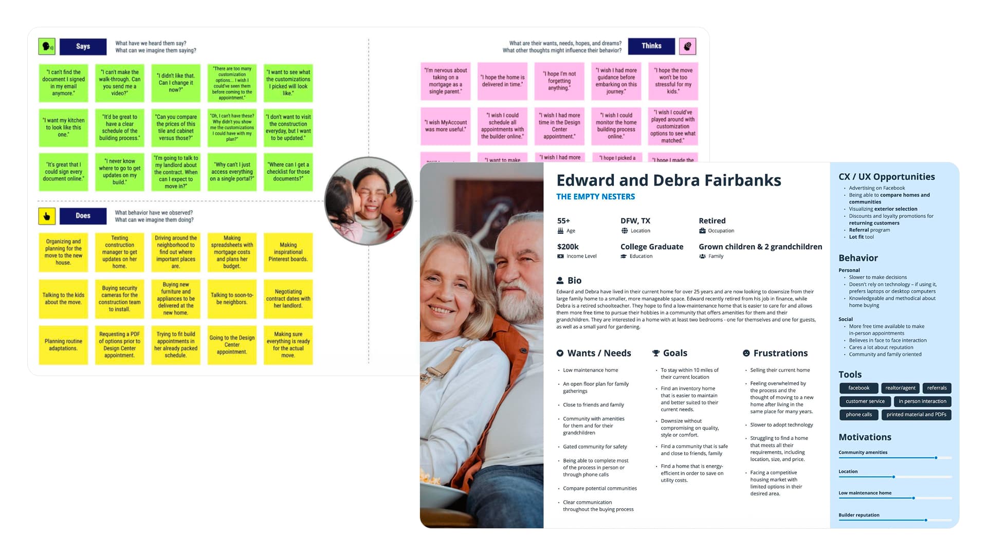
Customer personas and empathy maps.
User Testing & Competitive Analysis
I ran a general perception test through UserTesting.com where participants navigated both the existing site and competitor websites. This gave us a direct read on how the brand compared in real time. We took inventory of competitor features, categorized strengths and opportunities across the board, and assessed how each performed against key customer needs. We also conducted an accessibility audit to identify gaps against WCAG standards.
The sessions surfaced usability friction, content clarity issues, and moments where competitors were simply doing more to earn buyer confidence.
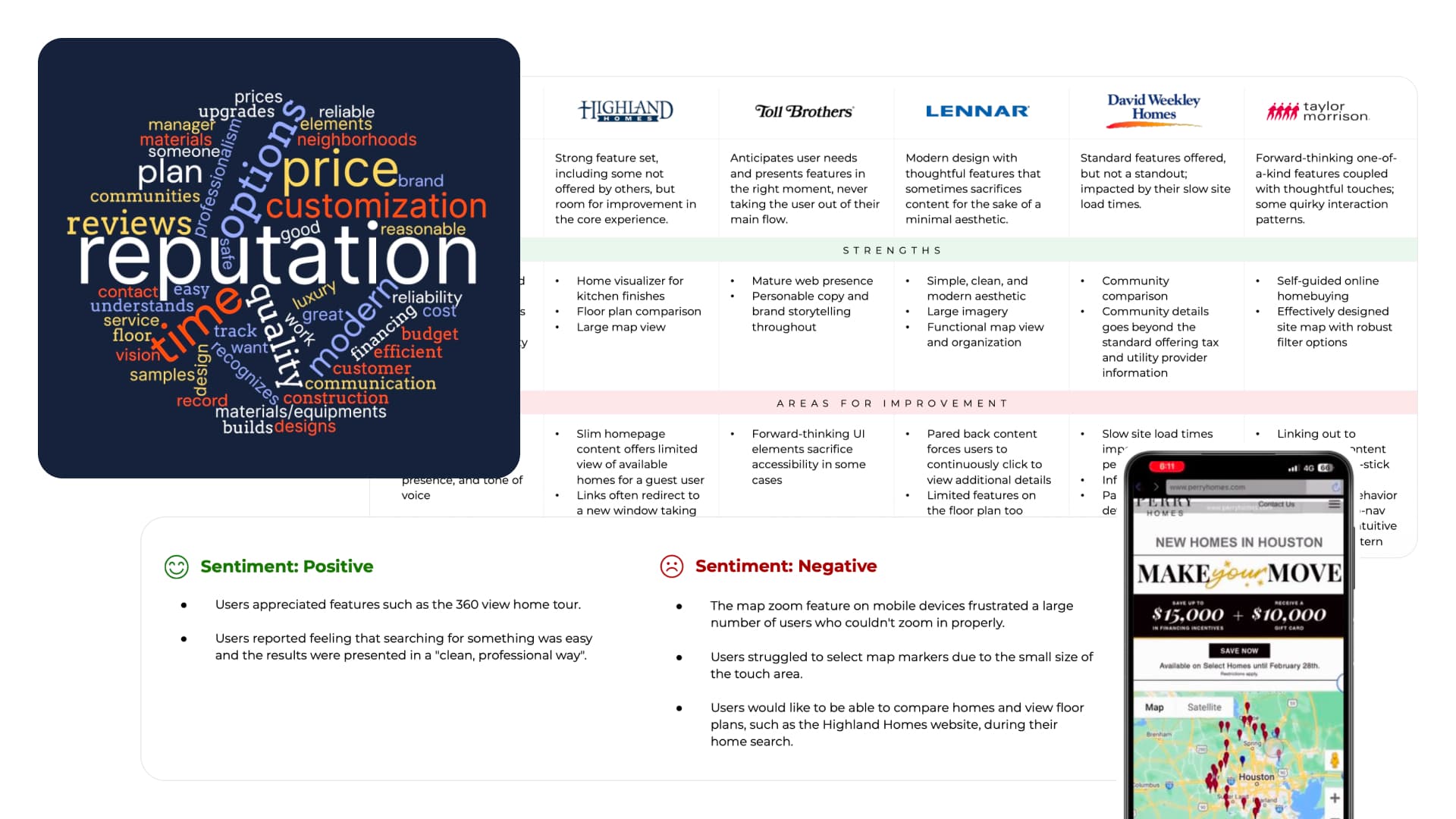
User testing and competitive analysis findings.
Service Blueprint
The channels inventory, stakeholder interviews, and customer interviews together gave me the inputs to build a comprehensive service blueprint. I facilitated three workshops with cross-functional teams, mapping the full journey from Home Shopper to Buyer to Owner alongside every internal action that supports them. What surfaced was a fragmented system held together by manual effort and a clear picture of where to focus.
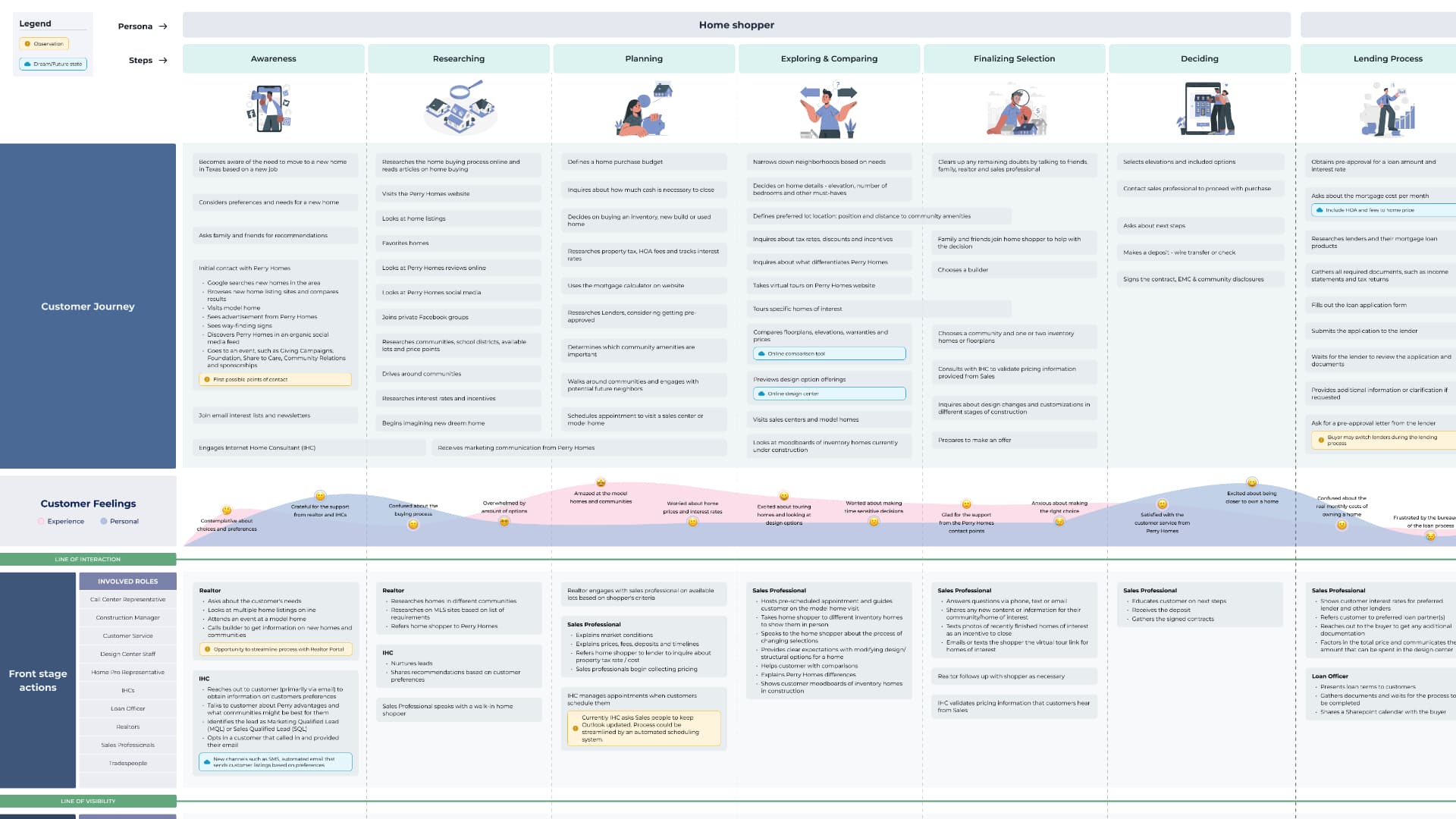
Service blueprint full customer journey.
How Might We's
To close out discovery, I facilitated a series of How Might We (HMW) exercises as part of a Lean UX canvas workshop with internal teams. The goal was to reframe the challenges identified throughout research as actionable design opportunities. HMWs like "How might we help buyers feel confident navigating options before their Design Center appointment?" became the bridge between what we learned and what we set out to build.
Phase 02
Design - Future Vision Prototypes
Website Homepage Redesign
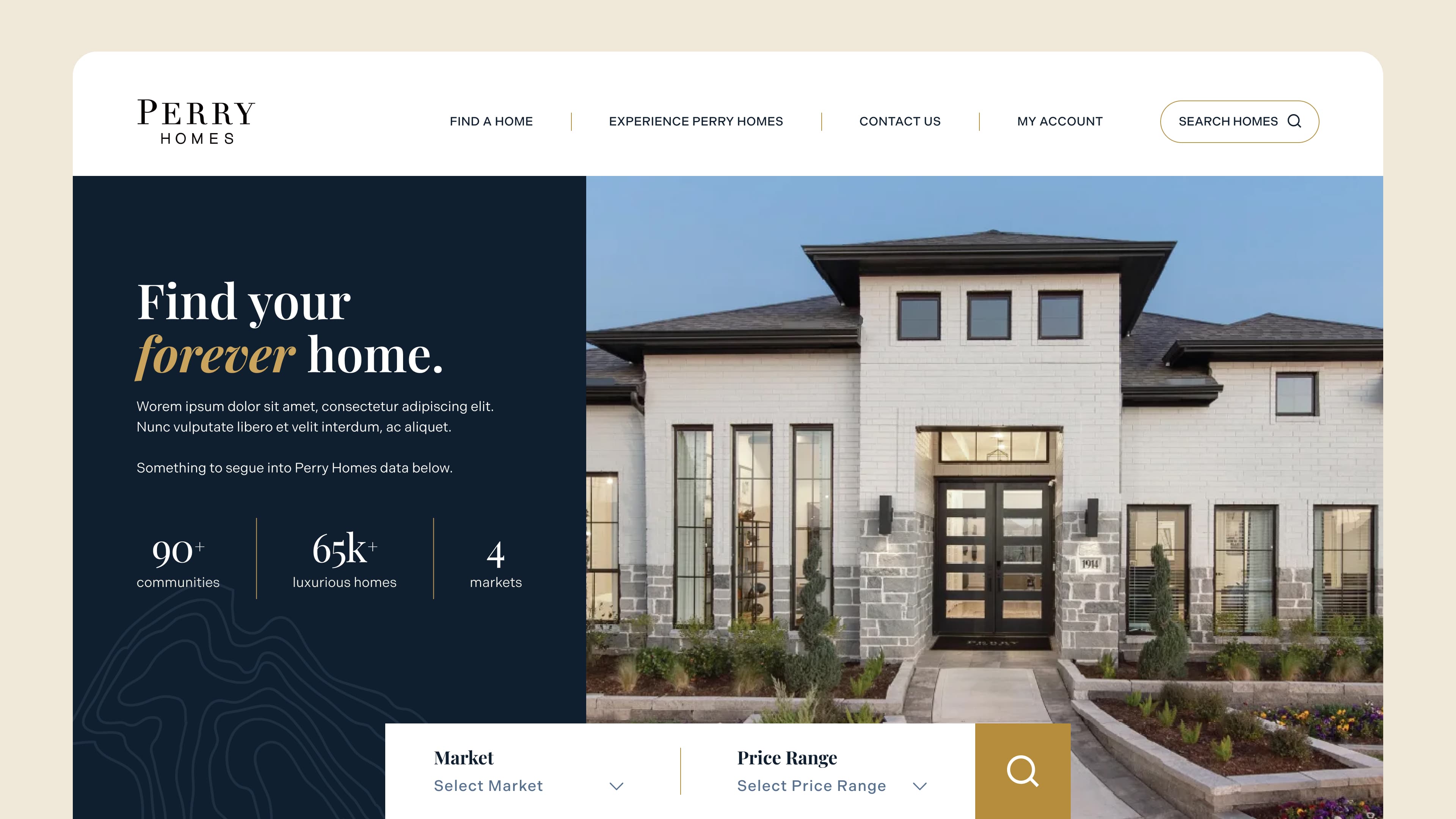
The existing homepage wasn't doing the job of earning trust or driving action. I redesigned it around two priorities: establish the brand's credibility immediately, and get buyers into the search experience as fast as possible. The result was a homepage anchored by a prominent search tool with market and price range selectors, brand proof points (90+ communities, 65K+ homes built, 4 markets), and a visual hierarchy that guided buyers from inspiration to intent.
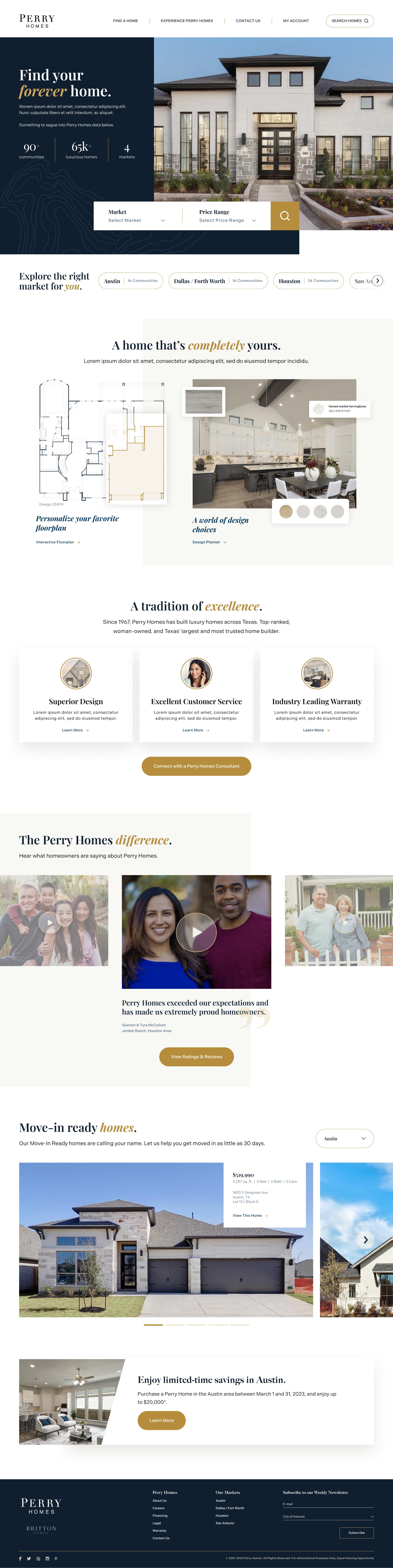
Perry Homes homepage redesign concept.
Search Feature with Map & List View
In research, I heard consistently that buyers wanted to browse geographically. They knew the general area they wanted to live and needed to see what was available there. I designed a map and list view that worked together: the map surfaced communities visually, while the list gave buyers the detail they needed to compare. Filters let users narrow from market down to community down to individual home, a significant improvement over the flat, text-heavy experience that existed before.
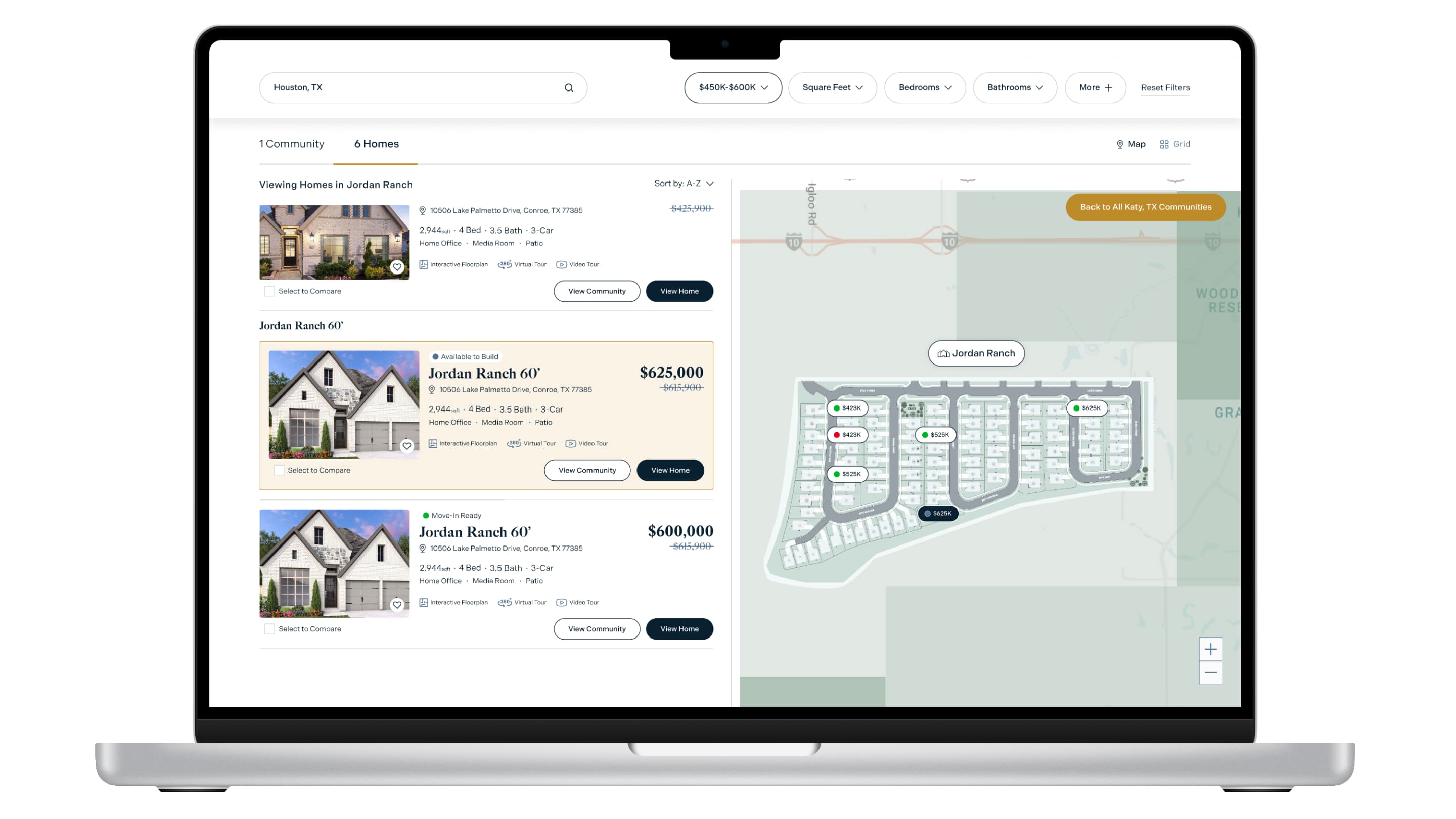
Search feature prototype map and list view.
Catalog Options List (COL)
Buyers were walking into Design Center appointments having never seen the options catalogue before, a 36-page document handed to them on the spot. It was a lot to absorb in the middle of one of the most significant purchases of their lives. I redesigned it as a visual, plan-based digital experience within MyAccount, letting buyers browse options and see estimated upgrade pricing on their own time, before they ever sat down with a Design Consultant.
Catalog Options List prototype.
Interactive Digital Sales Wall
Model home visits relied on manual, self-created systems. Sales professionals tracked visitor information through their own Excel sheets, handwritten notes, and personal workarounds. I designed a Check-In kiosk that replaced those fragmented methods with a single, data-rich engagement, letting visitors create a MyAccount on the spot and browse available homes while waiting for a Sales Professional.
Interactive Digital Sales Wall prototype.
MyAccount Messaging Center
Post-contract, buyers were juggling calls from Sales, Construction, and the Design Center, often getting conflicting information. I designed a centralized Messaging Center within MyAccount that brought everyone into a single thread, reducing coordination overhead and giving buyers full visibility into their process.
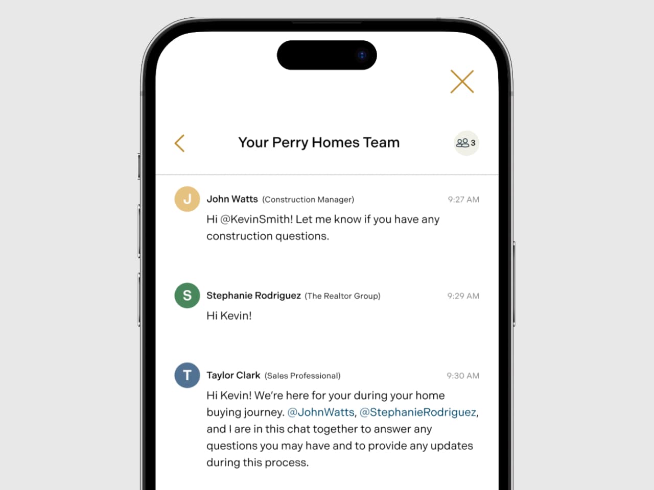
Centralized homebuyer communications concept across sales, construction, and design.
Results
Outcomes
Next Project
Center for Internet Security: Making Cybersecurity Accessible for Every Organization