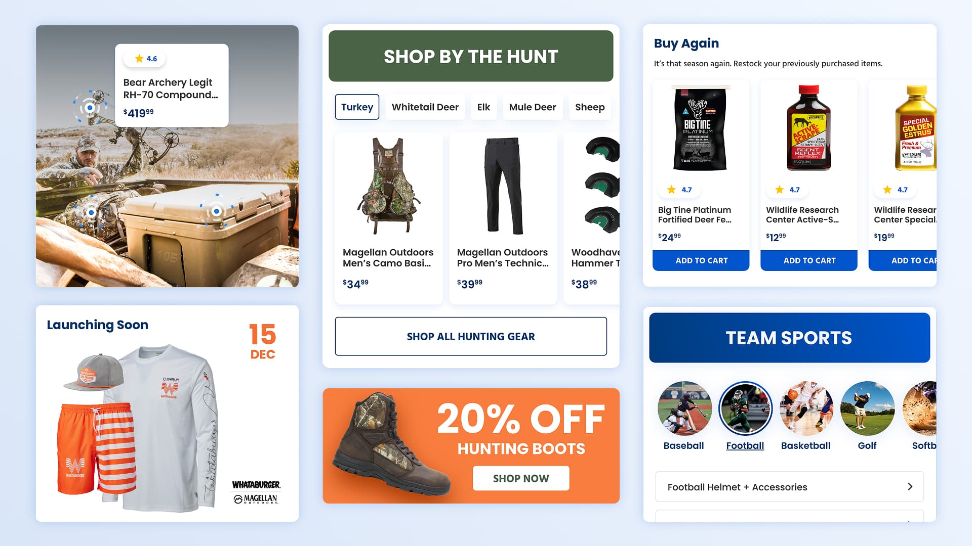
Academy's homepage was built around promotions and product volume, surfacing content the same way for every visitor regardless of who they were or what brought them there. The Next Gen homepage initiative was an opportunity to rethink that approach, moving toward curated experiences that felt relevant to the people actually shopping there.
Project Details
Phase 01
Discovery
Understanding the Landscape
Before concepting began, I needed to understand where Academy stood and what its customers expected. I mapped how leading sports and outdoors retailers approached content hierarchy and component variety, and analyzed Academy's own user behavior data using Quantum Metric and Google Analytics to identify which homepage modules were driving engagement.
What Users Said
The loading took longer time than I expected. There could've been more concise categorization of items so it's a shorter layout.
UserZoom Participant
I really liked the large tiles on the page—it clearly marked all the different shopping categories.
UserZoom Participant
I liked the different sections, but did not like the recommendations for me.
UserZoom Participant
Doesn't seem to have a narrow enough focus for me. There's womens, kids, mens, all demographic types clumped together.
UserZoom Participant
Sales and deals were bold and informative. It however did seem cluttered.
UserZoom Participant
It felt too much like scrolling past a bunch of ads.
UserZoom Participant

Click map showing engagement drop-off by page position.
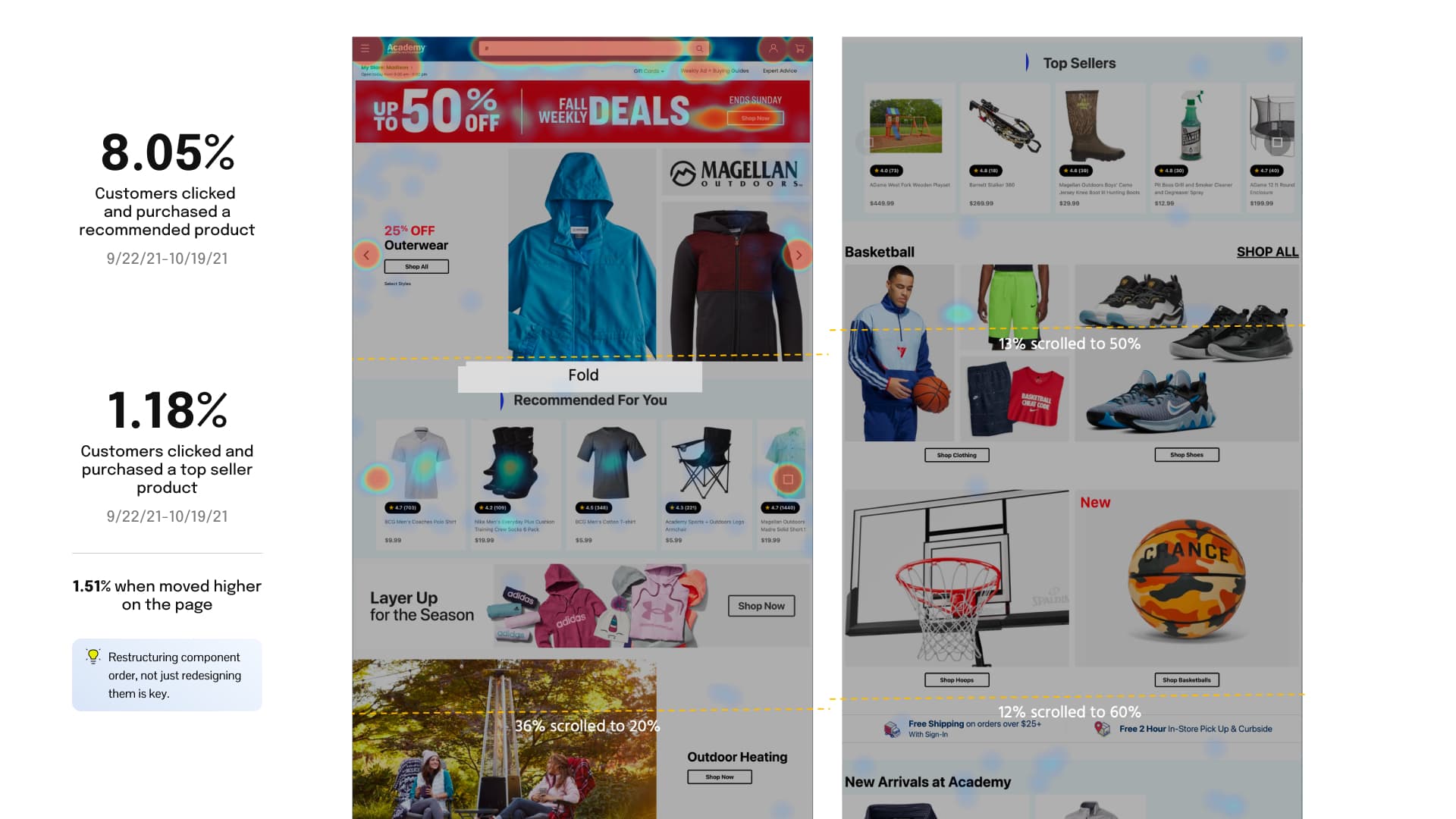
Heat map showing engagement patterns across the homepage.
Internal Team Input
Marketing
- Maintain design consistency through reusable components
- Experiences unique to a return user vs. a guest user
- Ability to reorder sections on the fly as promotions and content change frequently
- Components are too rigid and campaign-specific, requiring engineering for routine content updates
- Need more autonomy to populate and publish without custom development work
Merchants
- Personalized messaging or banners catered to the customer’s interest
- Focus group of women found the homepage to appear masculine
- 20-30% of homepage traffic—how can we be more impactful and increase our presence
- Variety of factors determines the order in which content are placed
Customer Care
- Customers still unclear on Free Shipping qualifications
Component Audit
The existing component set was limiting in scope and flexibility. Components were built as one-off solutions for specific campaigns with no ability to retheme or reconfigure for a new season without engineering involvement. The audit surfaced 14 component patterns that competitors were using, each representing a clear opportunity to better serve Academy's customers.
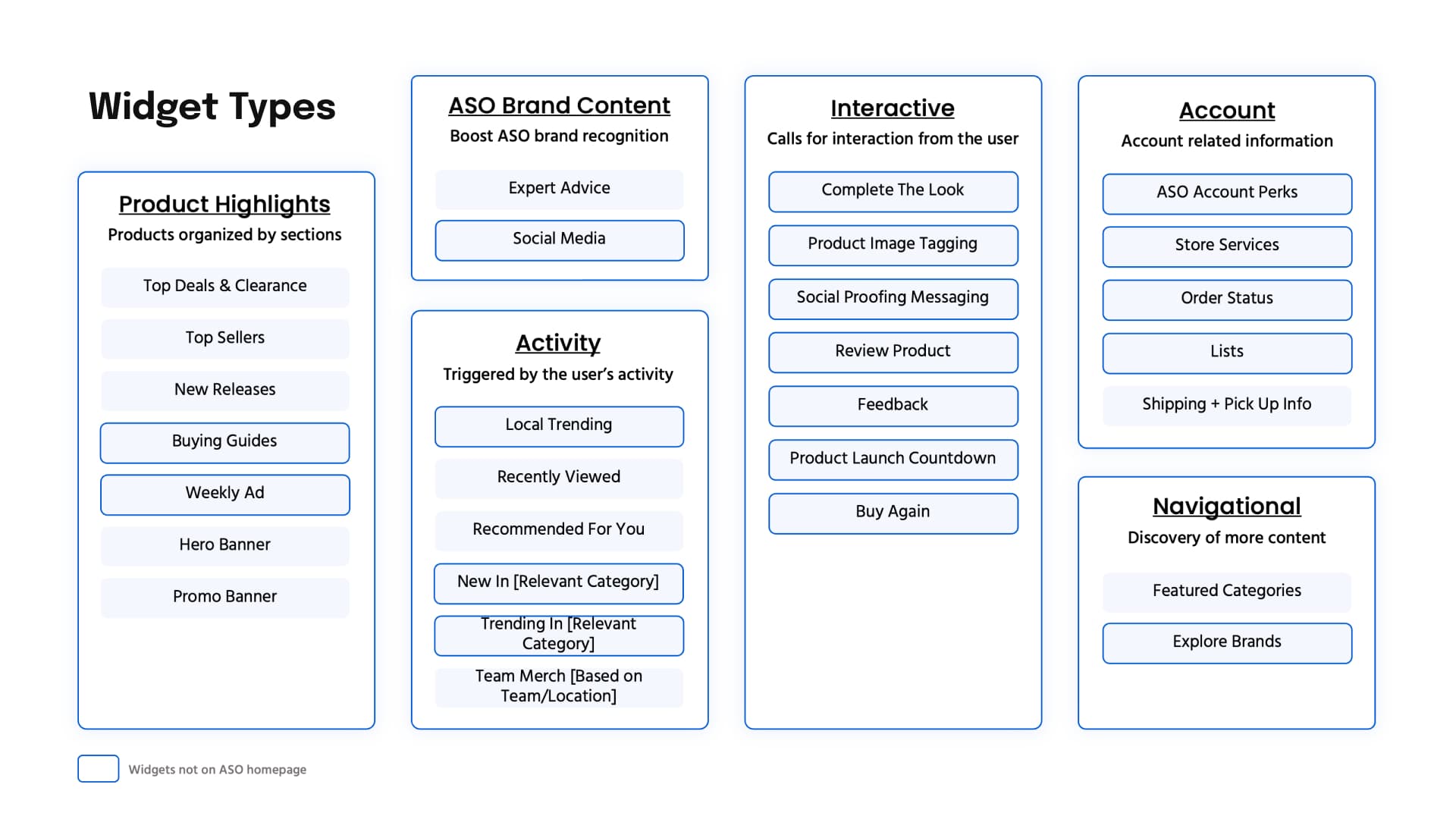
Uncovering the component opportunities for Academy's homepage.
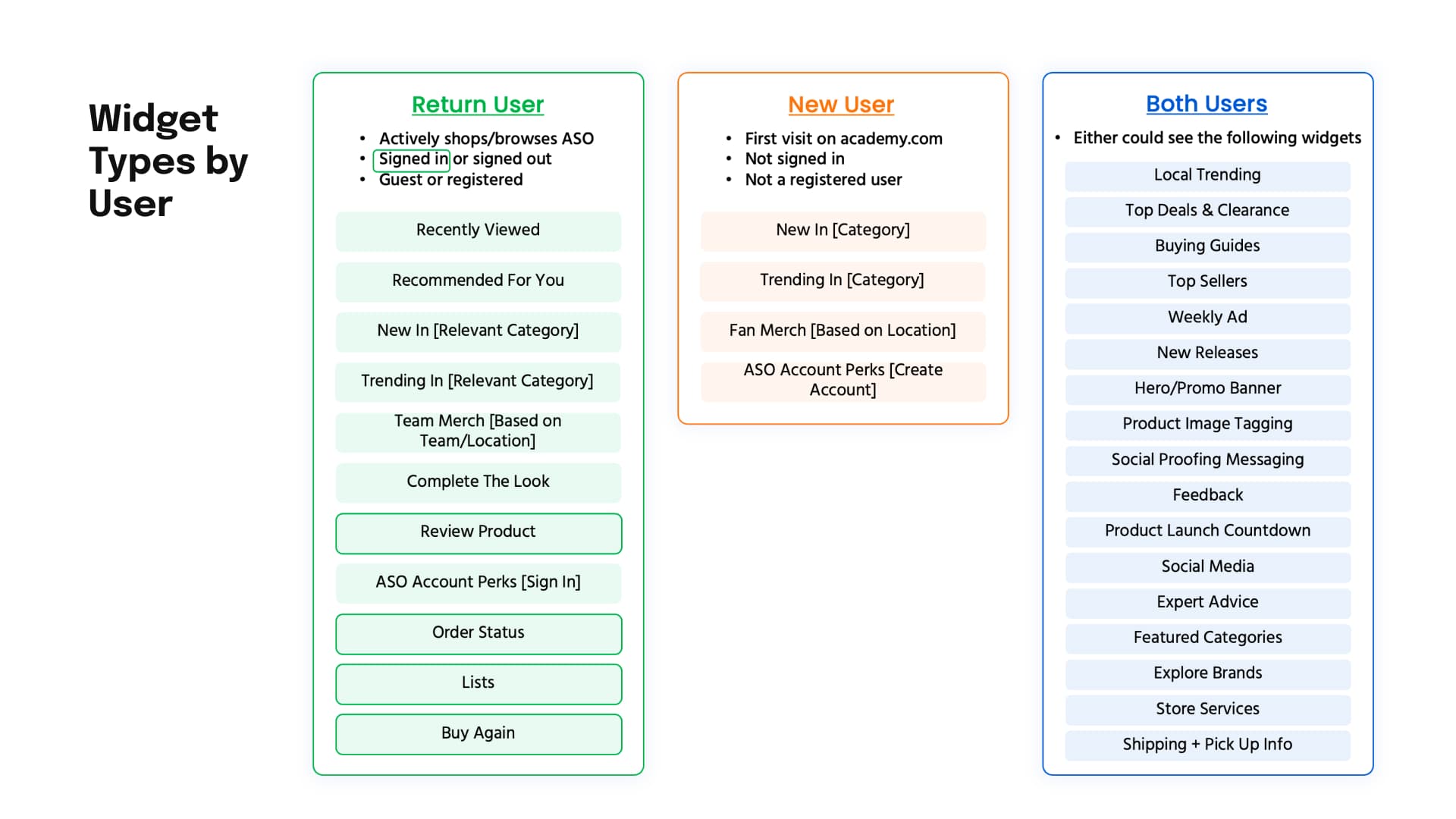
Categorizing components to general user types.
Phase 02
Design
Modernizing the Component Set
The design work began with the components themselves. Rather than designing for a single campaign or season, every component was conceived to be reusable and reconfigurable regardless of the time of year. Visual language was modernized: tighter typography, more intentional imagery hierarchies, and a consistent spatial system that felt closer to where Academy's brand was heading.
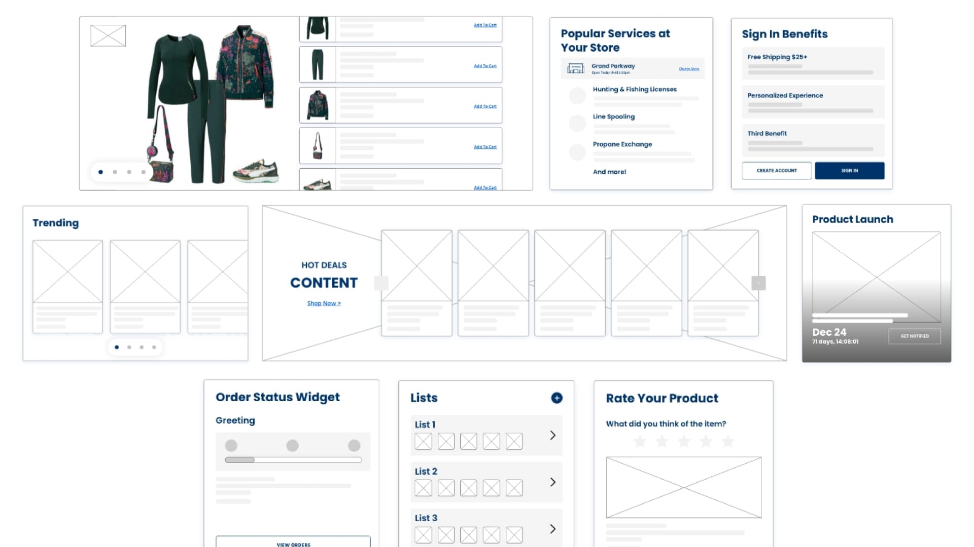
Component wireframes for the Next Gen component set.
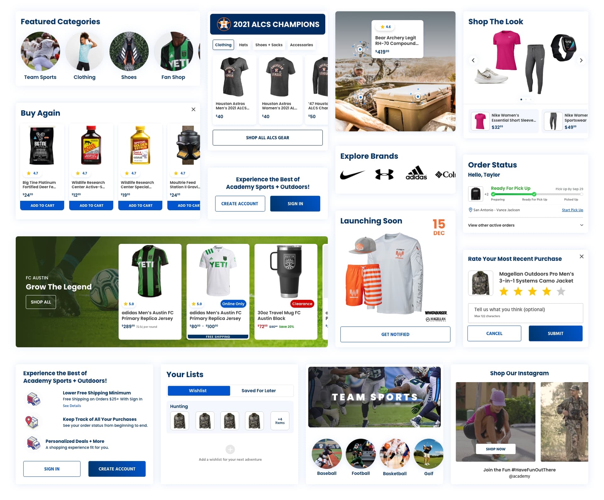
Next Gen component set in high fidelity.
Grid Restructure & Nesting System
The existing grid was narrow, constraining how components could be arranged and how many high-value modules could appear earlier on the page. Quantum Metric session recordings showed that components placed higher on the page converted at 1.51% more than those further down, making it clear that what appeared higher on the page had a direct impact on conversions. Working with the dev team, I redesigned the grid to support a wider layout and co-developed a nesting system that allowed Next Gen components to be combined in a variety of configurations, giving the marketing team more flexibility without requiring custom engineering work for each variation.
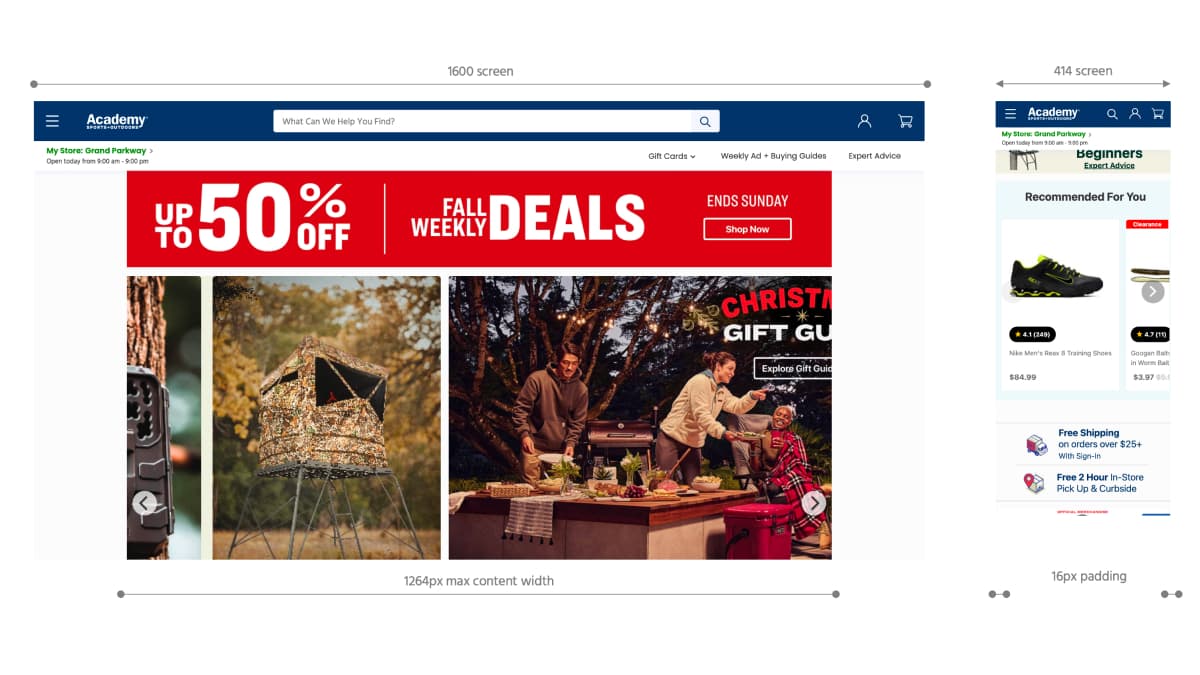
Legacy grid structure.
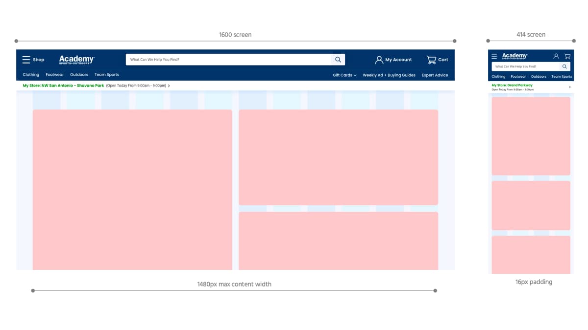
Proposed grid structure and nesting system.
Audience-Based Homepage Concepts
With a modernized component set and scalable grid in place, the work turned to the homepage concepts themselves. Focusing first on scenarios that represent a select few of Academy's primary customer audiences: an outdoorsman and a mom shopping for her family.
Each concept demonstrated how the same component architecture could produce meaningfully different homepage experiences based on who was shopping. The outdoorsman concept surfaced hunting, fishing, and camping content prominently. The mom concept prioritized team sports, kids' apparel, and value-driven promotions.
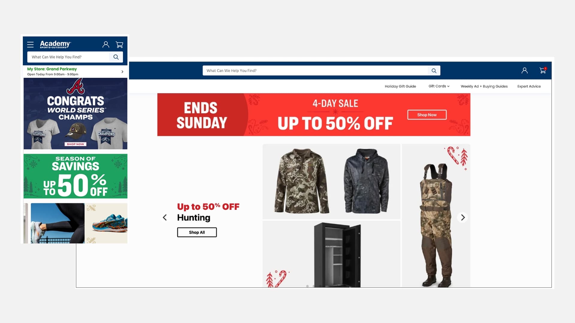
Legacy homepage design and components.

Homepage concept for a returning user who has an interest in outdoor sports & activities.

Homepage concept for a mom who frequently shops at Academy for her family and herself.
Results
Outcomes
Next Project
Enterprise: Driving Confidence Through Testing