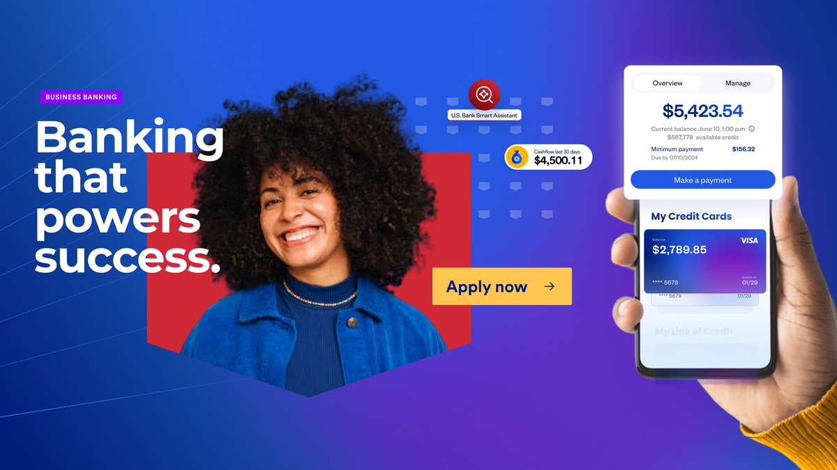
Business banking customers had the intent to bank with U.S. Bank but the site wasn't giving them a reason to stay or commit. We set out to design an experience that made it easier for customers to understand what the bank offered, feel confident in choosing it, and know exactly how to take their next steps.
Project Details
Phase 01
Discovery
The UX research team led discovery through heuristic evaluation, generative research, archetype development, and existing segmentation review. Their output defined where the experience was falling short and gave me and my team a clear brief.
Creative Competitive Analysis
We ran a creative competitive pass focused specifically on how financial brands were using visual language, hierarchy, and content strategy to communicate trust and modernity simultaneously. The goal was to identify where the category was playing it safe and where there was room to push the brand forward.
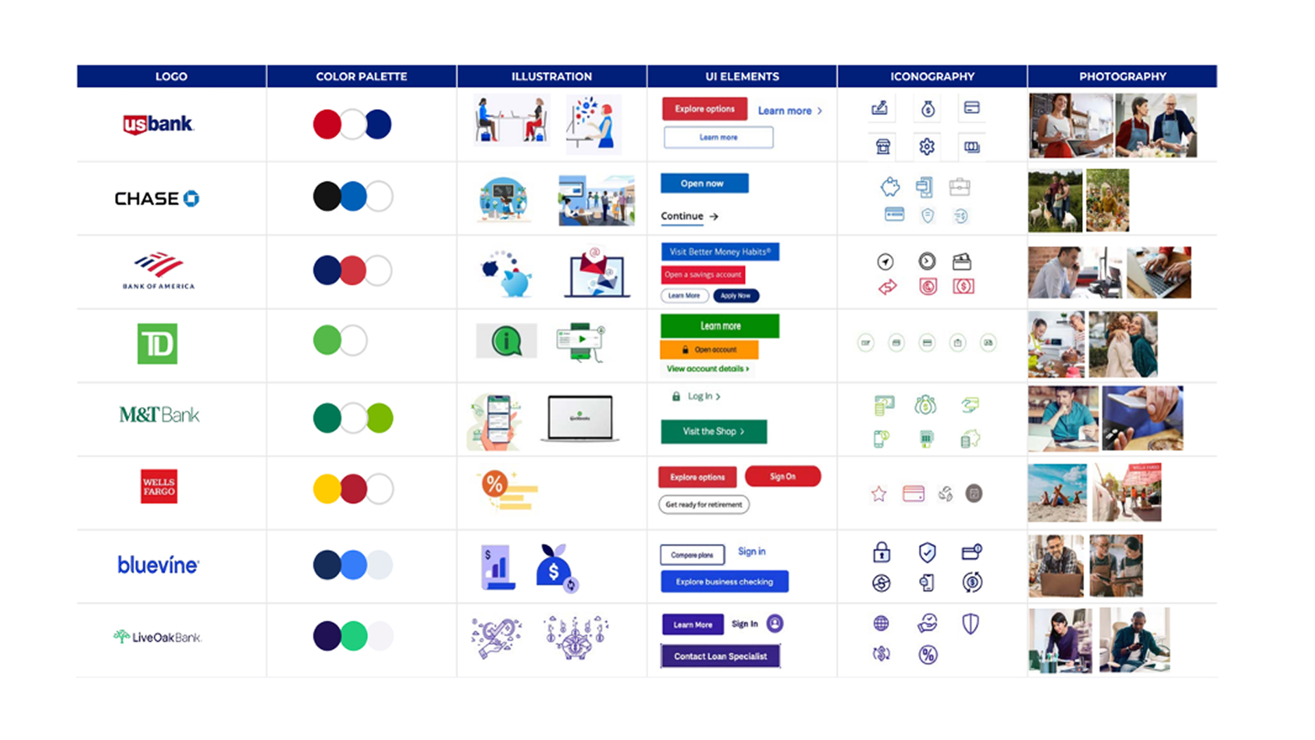
Creative competitive analysis.
Creative Moodboards
U.S. Bank had an established design system and visual identity. Business Banking needed to feel more elevated and distinct without breaking from the brand entirely. I developed moodboard directions as a spectrum from least to most expressive, giving stakeholders a concrete way to align on how far to push.
A blend of elements from each concept resonated with stakeholders, bringing together the familiarity of the existing brand with the sharper visual edge that made Business Banking feel distinct.
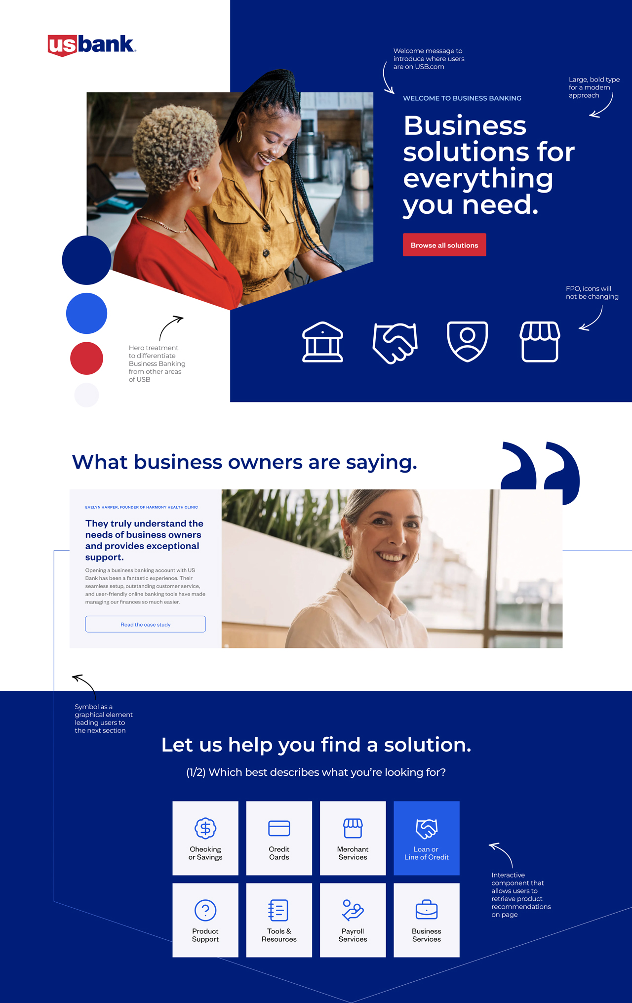
Moodboard concept 1: Finding an edge and emphasizing on the visual elements that make U.S. Bank distinct while staying close to the current look and feel.
Phase 02
Design
Designing to Four Experience Principles
To ensure alignment across a large cross-functional team, all design decisions were anchored to four experience principles established during discovery. Each one shaped how we prioritized, evaluated, and pushed back on design decisions throughout the project.
Homepage Design
The homepage was the first opportunity to give customers a reason to stay. I designed it to clearly communicate what the bank offered, surface the credibility signals customers needed to feel confident, and make it easy to take a next step whether that was exploring a product, reading a comparison, or reaching out to someone directly.
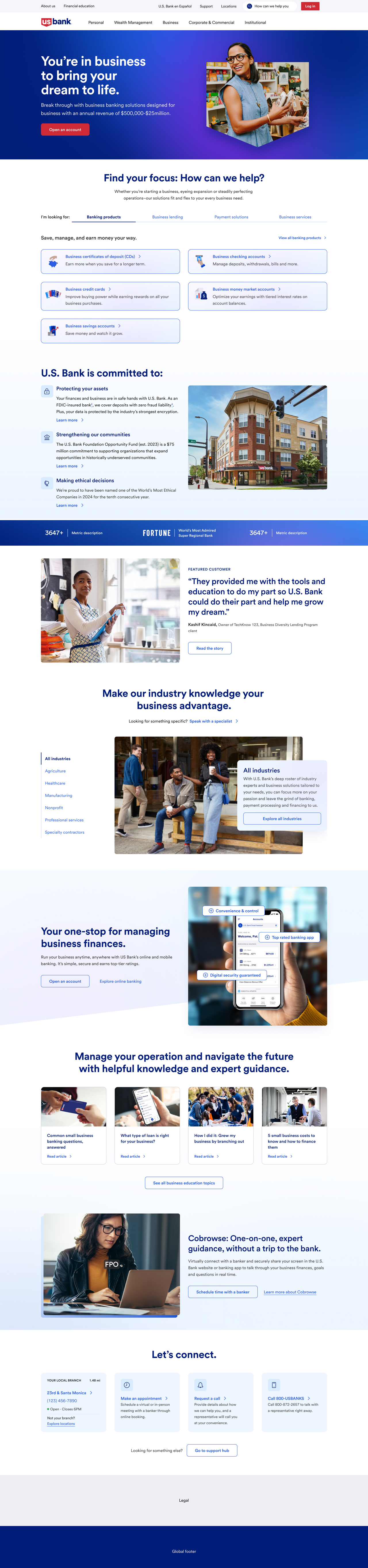
Business Banking homepage redesigned.
Component Design
I led the design team to design 34 components. The existing design system served as the foundation, but we had the liberty to push and evolve the brand in alignment with the moodboard direction the client selected.
The components highlighted relatable moments that connected with potential customers, supported users in discovering products relevant to them, and reinforced the brand in a way that felt genuinely trustworthy.
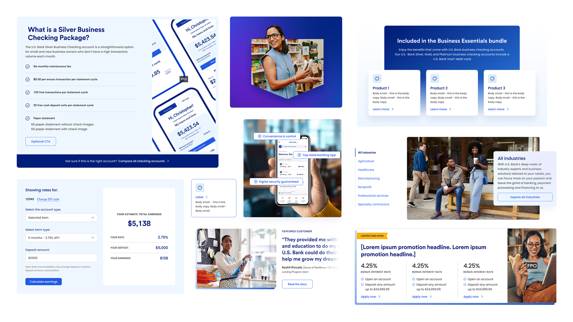
New components that support users in their journey from accolades banners, industry selector, pre-requisite product overview, to a product recommender.
Page Templates
I led the team to design 11 page templates covering the full range of business banking page types, providing direction and feedback throughout. Archetype journeys and user research guided hierarchy, content zones, and component placement across each template.
From there, the production team applied content across all 11 templates to deliver 86 pages in AEM. I reviewed their work throughout to ensure design consistency with the templates and provided feedback and solutions where needed.
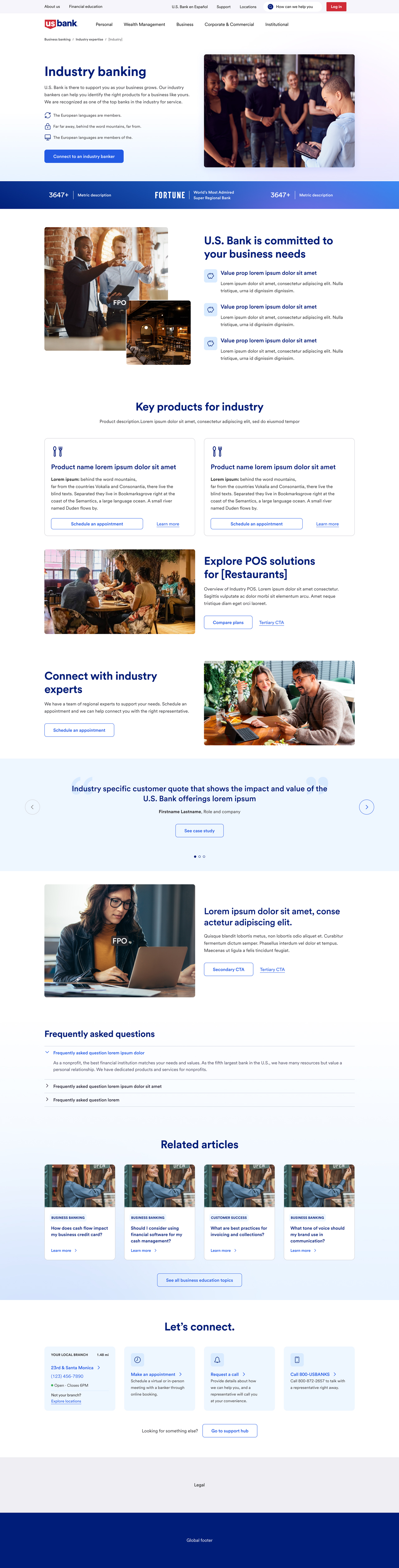
Industry page template built from carefully placed components to ensure every element serves a purpose.

Bundled product page template.

Banking account page template.
Revising Business Banking Information Architecture
We optimized the navigation pattern to make it easier for customers to find the right offering. The redesign also accounted for future promotional opportunities within the nav, giving teams a defined space to surface timely offers without disrupting the core structure. The sub-navigation approach we established for business banking was later adopted by other verticals at U.S. Bank.
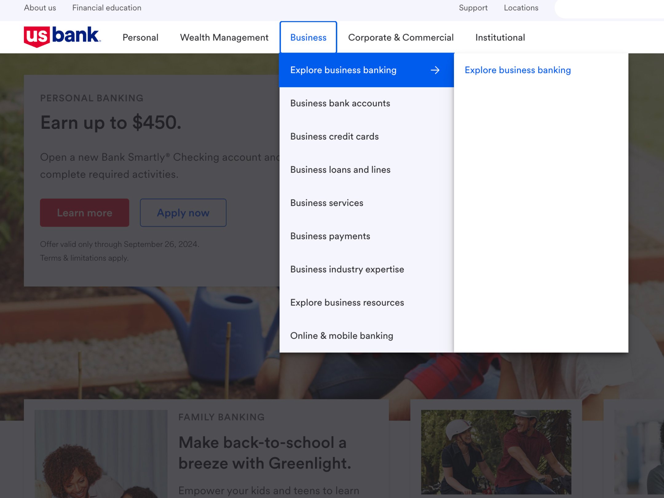
Legacy navigation design pattern.
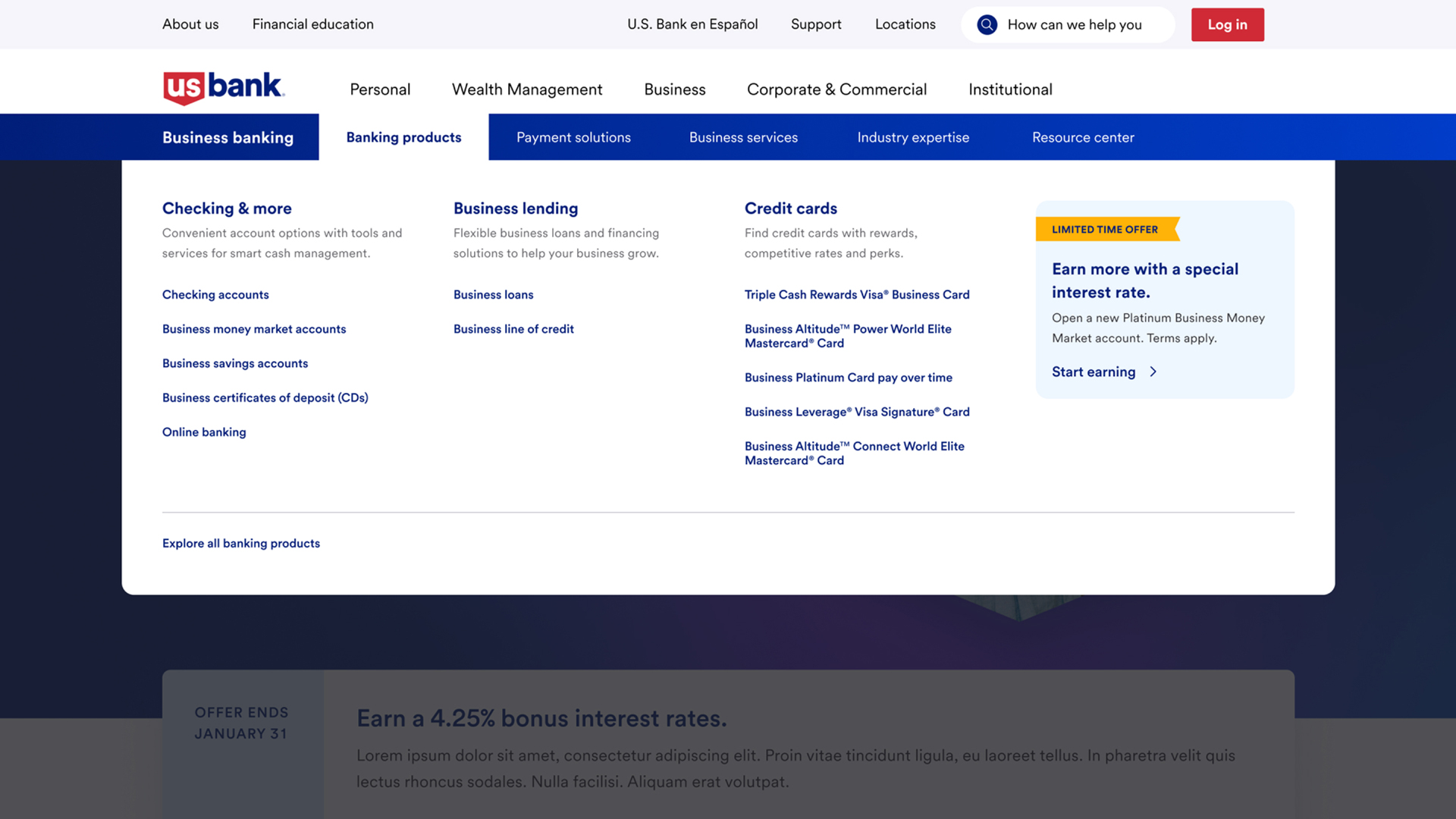
Redesigned navigation pattern introducing a sub-navigation, clearer hierarchy, and opportunities for promotions.
Results
Outcomes
Next Project
Perry Homes: A Modern Digital Home Buying Journey