Workstreams

Center for Internet Security

Making Cybersecurity Accessible for Every Organization

Near-term UX/UI concepting for a growing member portal, building a design system where none existed, and a steady stream of feature work — including a membership transition that launched June 2025.

UX/UI DesignUsability TestingDesign SystemsDigital Transformation

I've been embedded with CIS across an extended engagement that's covered a lot of ground. Two things have anchored most of the work: concepting near-term UX/UI for the member portal, and building a design system from scratch. Running alongside that has been a steady stream of feature requests and one-off flows — things that needed to be scoped, designed, and shipped on their own timeline. The MS-ISAC transition is one good example of that second track.

Workstreams

Workstream 01

Portal & Experience Design

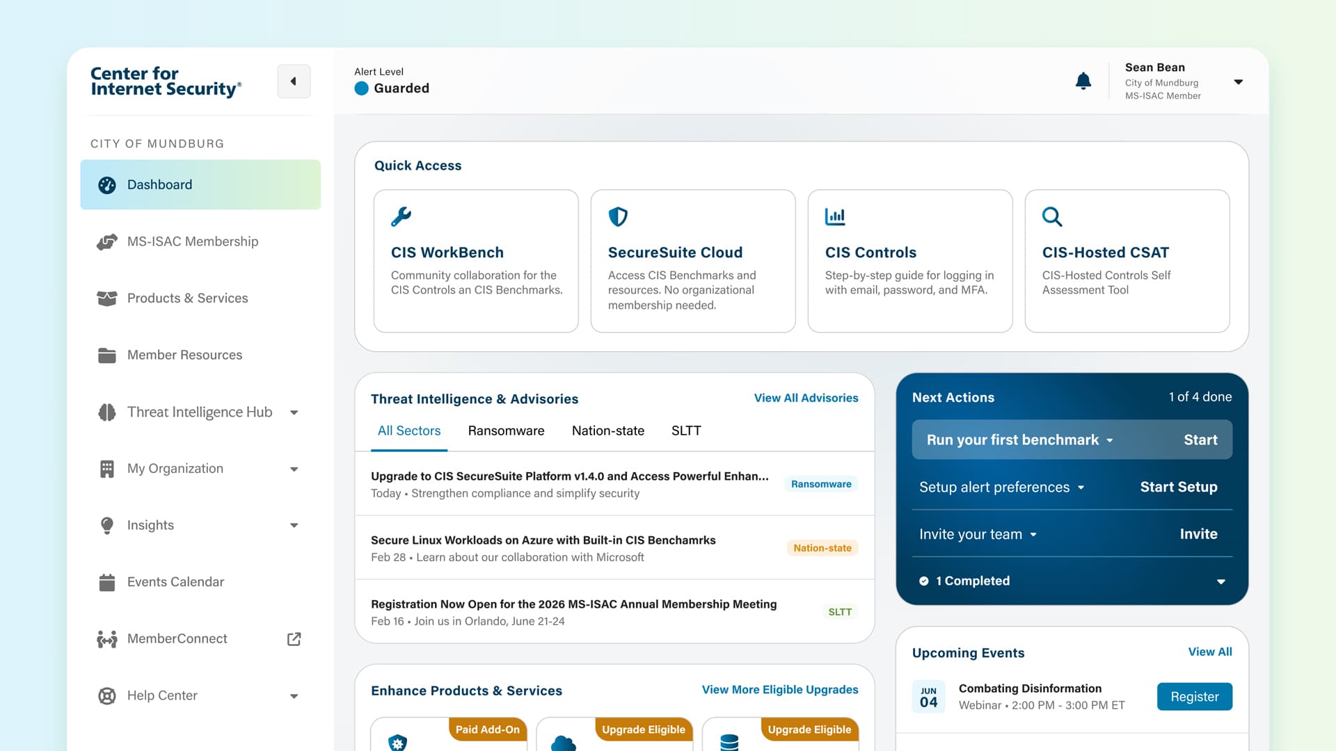
When I joined, the brand and visual language were already set and there was a dashboard concept in place as the north star. What didn't exist was a design system or component library — which meant the team was recreating patterns from scratch every time. I took ownership of two things: concepting near-term UX/UI for portal surfaces beyond the dashboard, and building the system that would let us ship consistently.

Design System

The Foundation That Makes It All Consistent

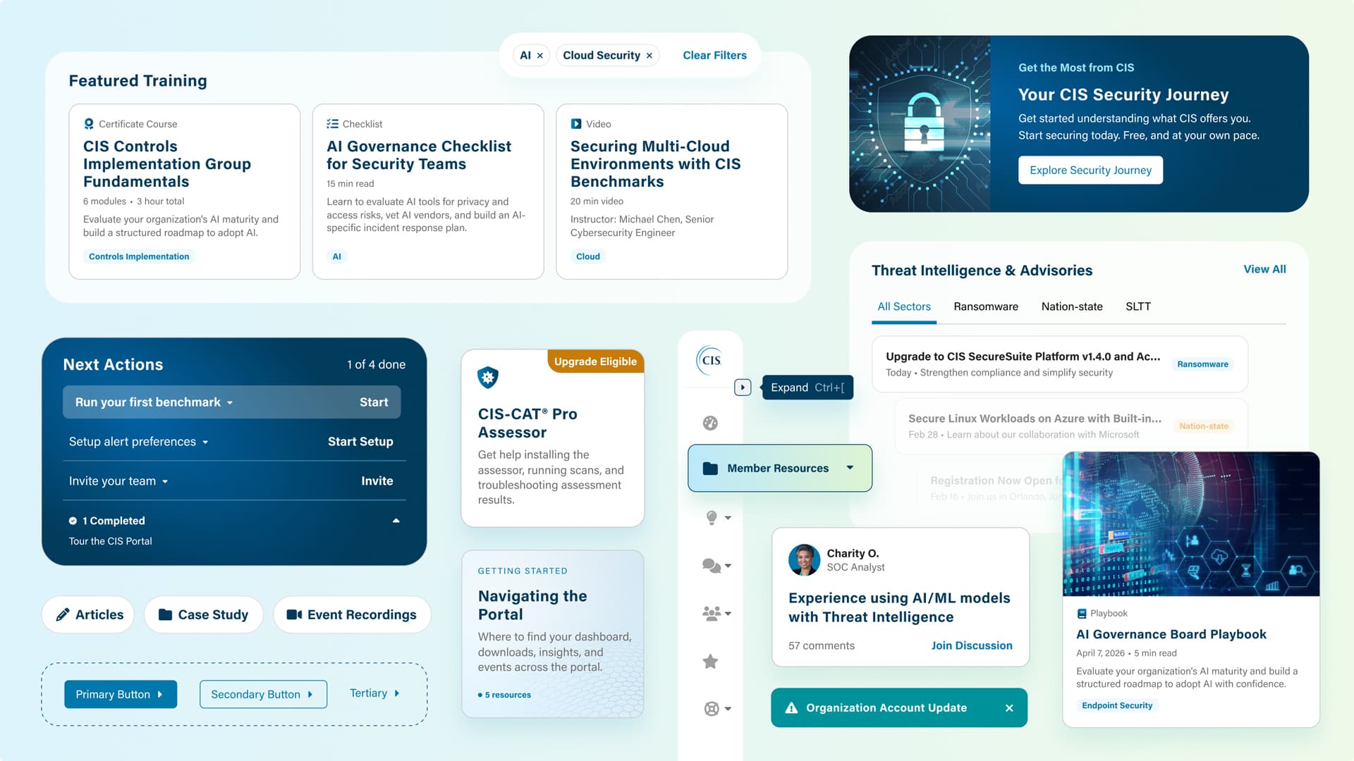
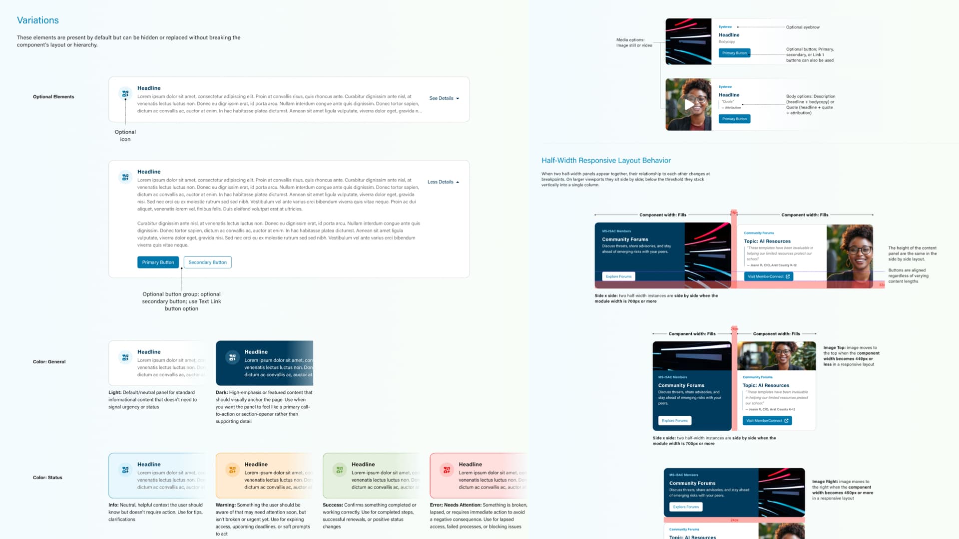
Building the Figma Design System

When I joined, there was no shared component system. The team was recreating patterns from scratch across files — no tokens, no shared naming, nothing keeping color, type, and spacing consistent between design and engineering. It was slowing everyone down.

I built it from the ground up: token architecture first, then components with full state coverage, variants, and documentation. The goal was simple — give design and engineering one place to pull from so we weren't solving the same problems over and over.

Design system — Figma component library

Component library — token architecture, component variants, and documentation across the full system

Future State Concepting

Near-Term Concepts Grounded in What Could Actually Ship

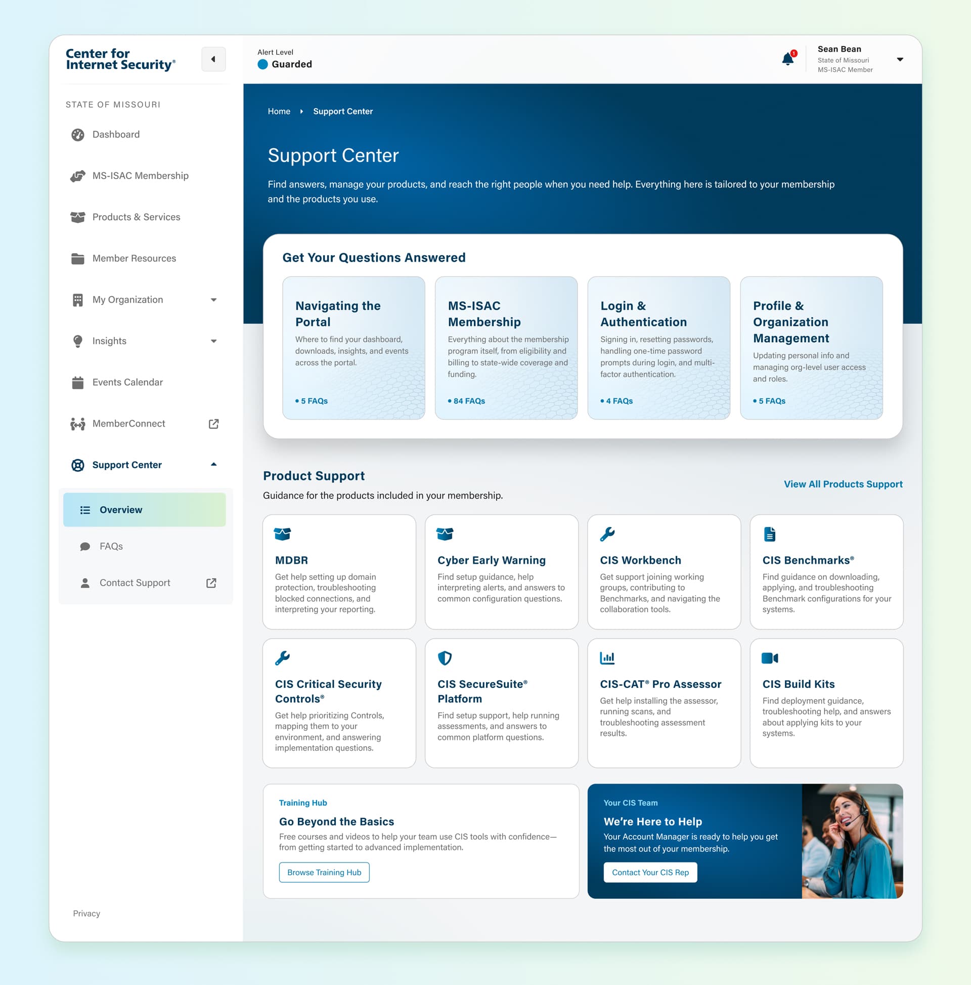
Resource Center, Products & Services, and More

The dashboard concept set the direction for where the portal was heading. My concepting work built on that — Resource Center, Products & Services, and other surfaces as they came into scope.

Every concept was a close collaboration with tech and dev. We'd pressure-test ideas against what was feasible for upcoming releases early, so by the time something went to high fidelity it was already grounded in reality — not just a pretty screen that couldn't be built.

Key Insight

The north star is useful until you have to ship. The job was figuring out what could actually happen next.

Dashboard — concept explorations

Products & Services — concept design

Portal — near-term UX/UI concepts for Resource Center, Products & Services, and additional surfaces

Outcomes

Results

Near-term UX/UI concepts for Resource Center, Products & Services, and other portal surfaces — all designed in close collaboration with tech and dev, tied to what could actually ship in upcoming releases.

Went from no shared system to a fully documented Figma component library with token architecture. Design and engineering stopped recreating patterns from scratch and started pulling from one place.

18,000 members onboarded since the early 2025 launch, with page views up 3,000 from February to July 2025. People are coming back.

Workstream 02

Feature Requests & Discrete Flows

On top of the portal and design system work, there was a pretty consistent stream of feature requests and standalone flows throughout the engagement — each one scoped and designed on its own timeline. The MS-ISAC membership transition is a good example of how those typically went.

The Approach

Mapped out the full member journey — from the moment they heard about the funding change all the way through subscribing — to find where things were likely to break down.

Kept the flow as simple as possible — explain what changed, show what's included, make it easy to subscribe. Plain language throughout, no unnecessary steps.

Tested with real users before launch to make sure the flow actually held up. Took what we learned and updated the design before it went live.

Example — MS-ISAC Transition

A Federal Funding Cut with Real Consequences for Members

The Problem

In 2025, federal funding cuts meant MS-ISAC could no longer be offered free to the state, local, tribal, and territorial governments that had relied on it. For a lot of those organizations — especially smaller ones — MS-ISAC was a critical resource. Threat intelligence, incident response support, security tools they couldn't build themselves.

Moving to a paid model was always going to be a sensitive moment. A confusing or clunky experience could easily cause members to drop off right when CIS needed to show the program was worth paying for.

Key Insight

This wasn't just a UX problem — it was a trust problem. People needed to feel like they understood what was happening before being asked to do anything.

Design

A Simplified Onboarding Flow Built Around the Member

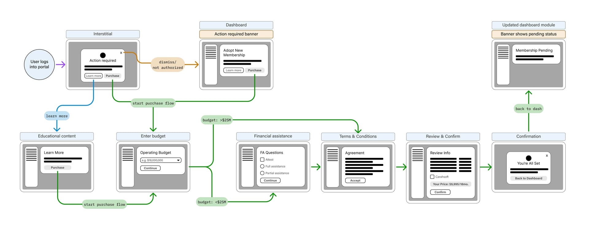
Wireframes & Flow Design

The flow had one job: tell members what changed, show them what they'd get, and make it easy to say yes. Wireframes explored a few different sequencing approaches — figuring out the right moment to introduce pricing, how to handle members who needed to go through procurement, and how to communicate urgency without making it feel like a hard sell.

Plain language was a constraint from day one, not something we cleaned up at the end. Every screen got checked against one question: would a non-technical government employee know exactly what to do next?

Onboarding flow — wireframes, annotated
Subscription flow — high fidelity screens

MS-ISAC transition — final high fidelity designs across the full onboarding and subscription journey

Usability Testing

Validating the Flow Before It Mattered Most

Testing Before Launch

We ran sessions with government IT administrators and security managers — the actual people who'd be going through this flow. The focus was on the moments most likely to cause problems: did they understand what the funding change meant, were the membership options clear, could they actually get through the subscription.

A lot came out of those sessions. The copy got rewritten based on how participants naturally described the change, we repositioned the pricing step, and added a confirmation state that people clearly needed. Went into launch feeling good about it.

Key Insight

People could get through the flow — but the original copy made the change feel like a loss. Reframing it around what they were gaining made a real difference in how the whole thing landed.

Usability sessions — annotated findings

Outcomes

Results

647 new members in the first month after the June 28 launch — people made it through the flow and committed.

1.9 million total bookings post-launch. Members weren't just signing up — they were actually using what the new tier gave them access to.

We tested it before it shipped. Knowing real users could get through the flow without issues made launching a lot less stressful.

Even organizations dealing with tight budgets and procurement hurdles were able to make the switch without losing access to what they needed. That was the whole point.

Next Project

Academy Sports & Outdoors: Helping Sports & Outdoors Enthusiasts Find Their Fun

View Project